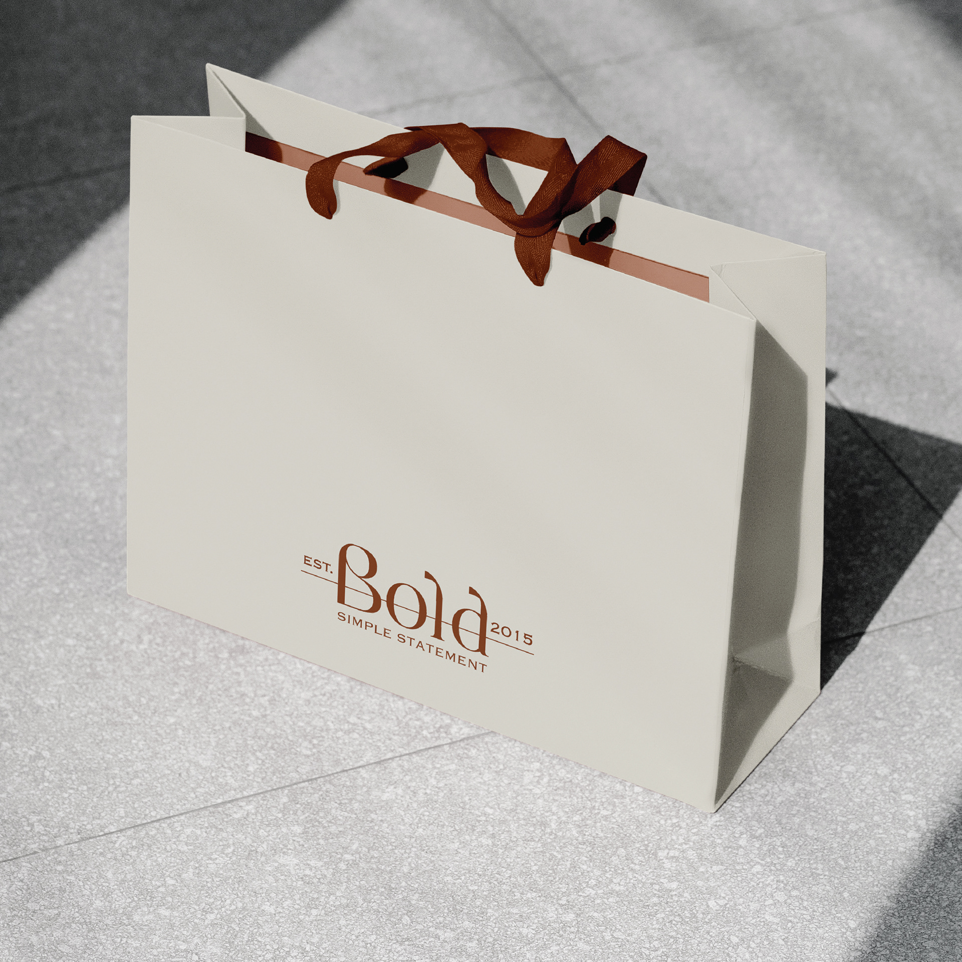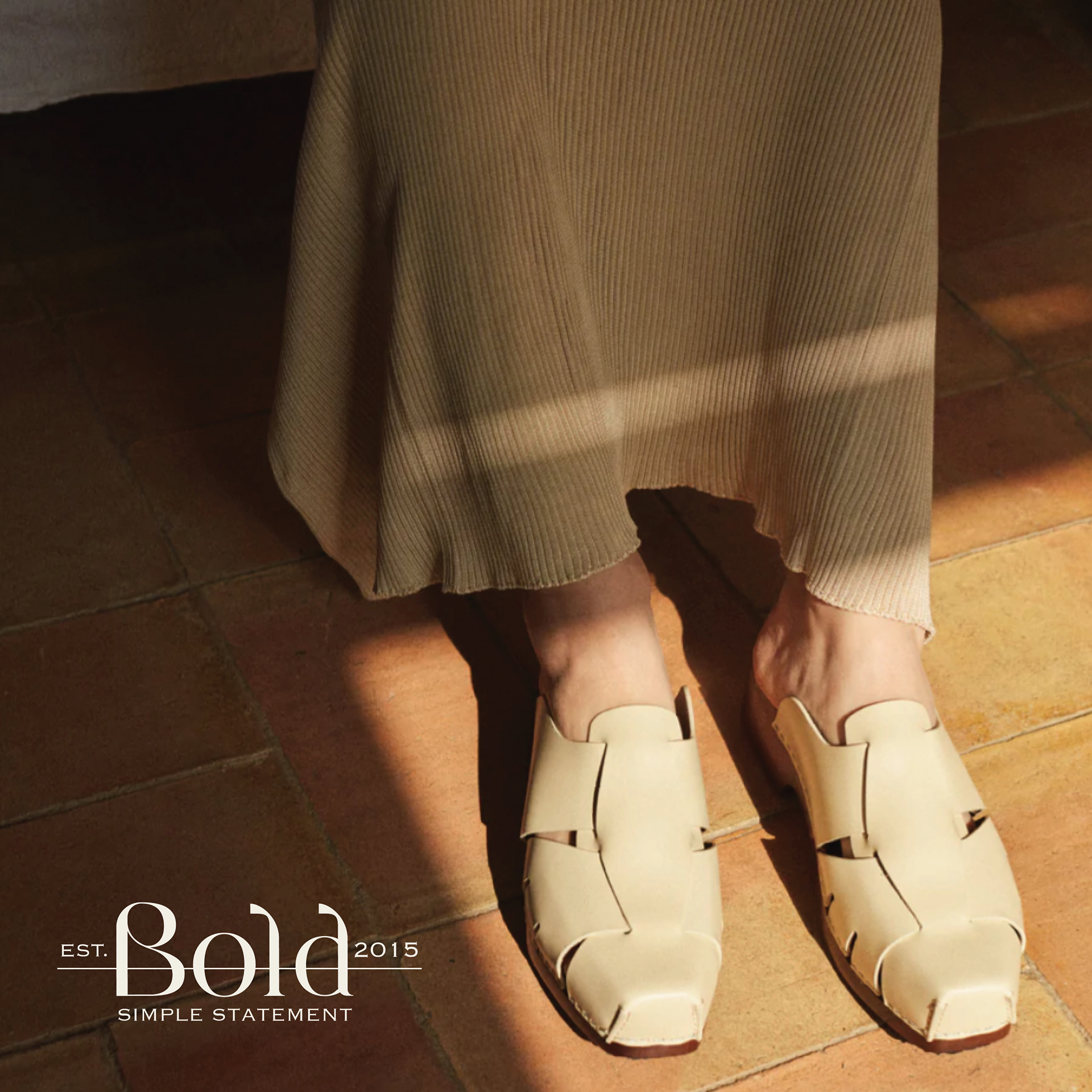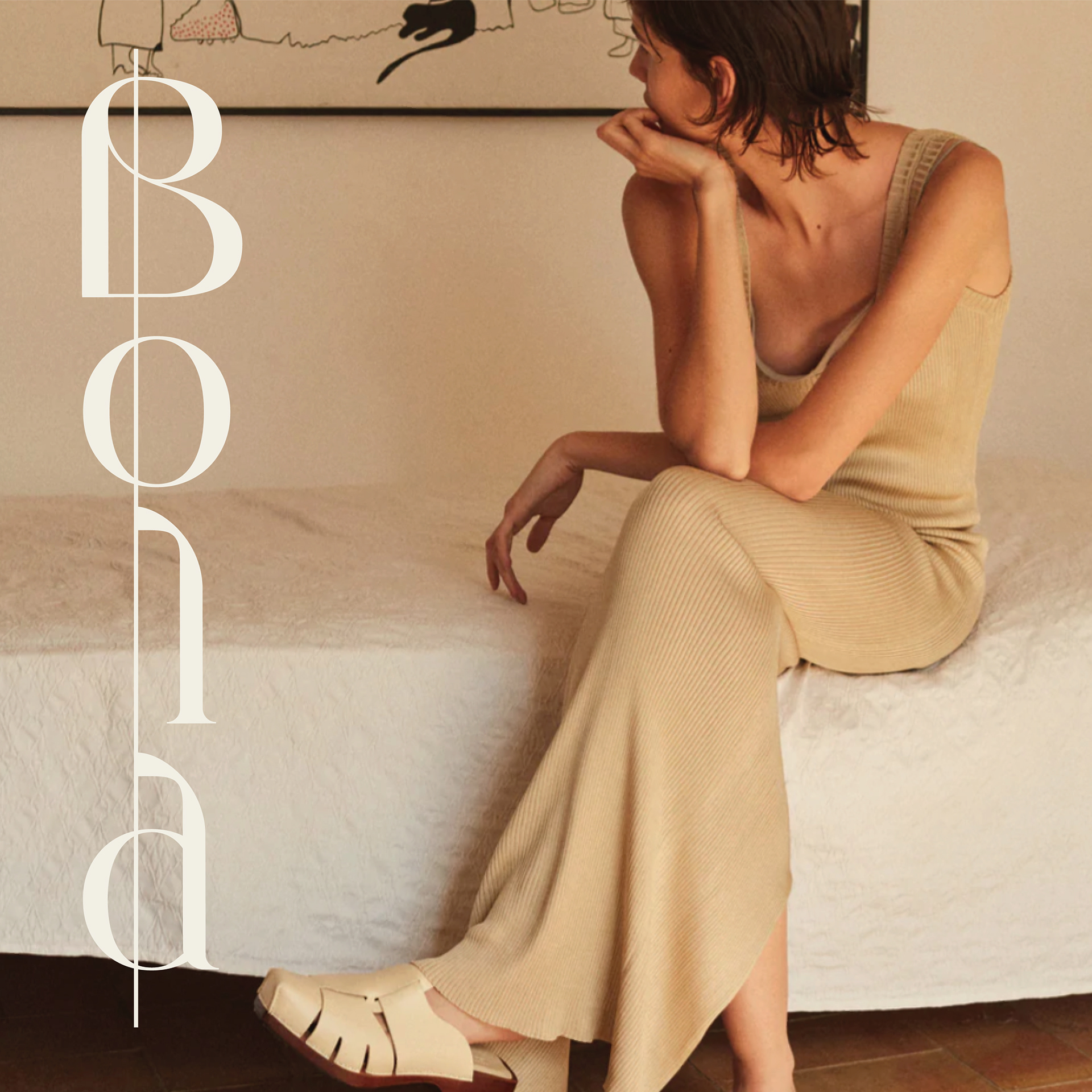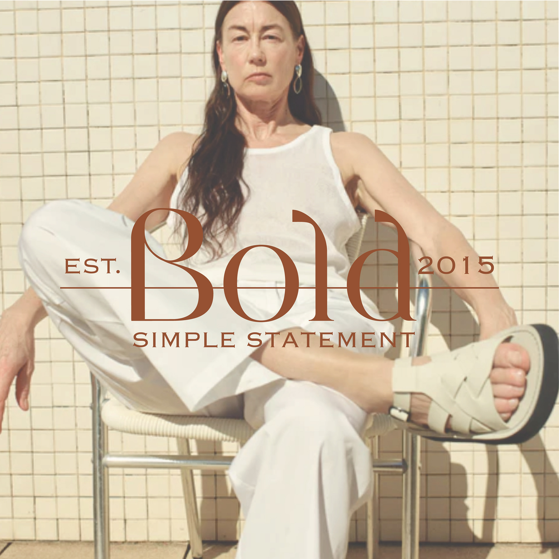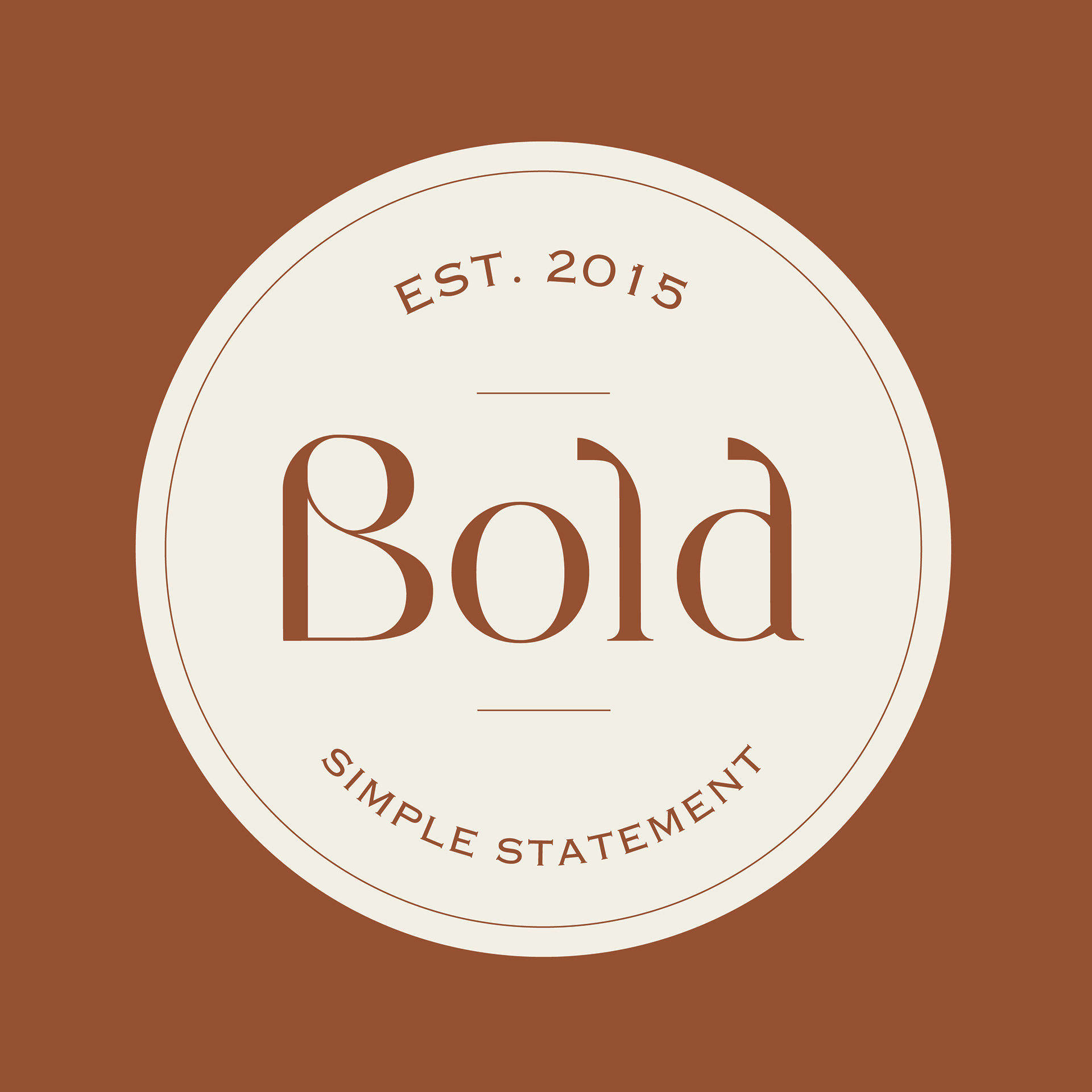

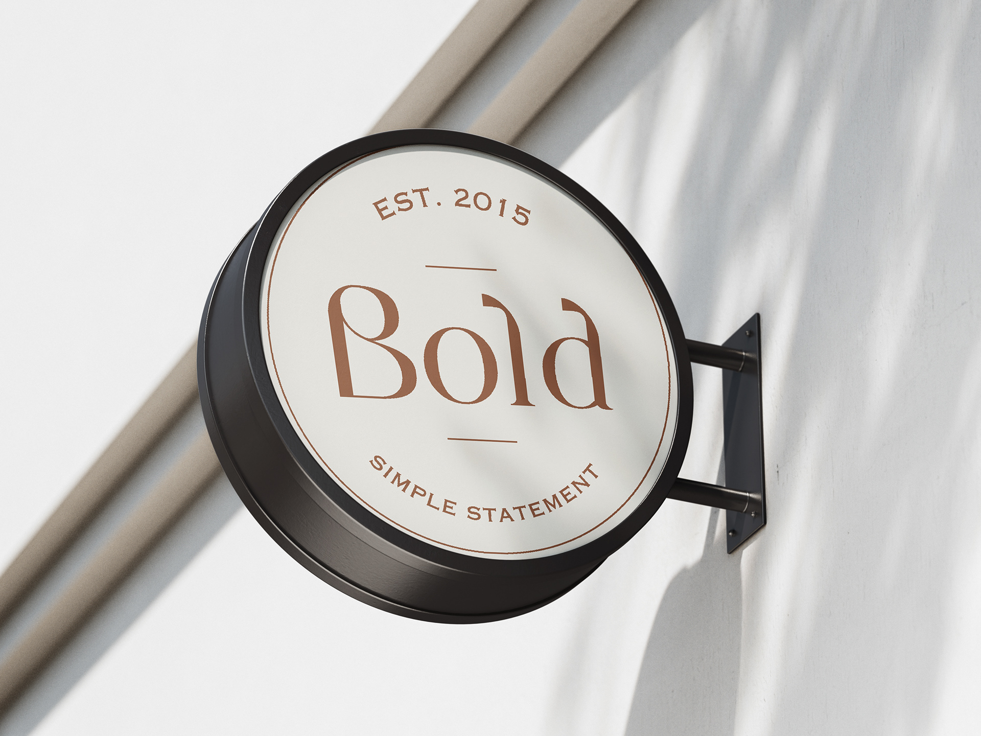
Rebranding of the online store, which also included designing the typeface. This is a brand that offers footwear, handbags and small leather goods. Its characteristic feature are pieces that can be combined together. Through my project, I wanted to show the contrast between the name and the graphic design. I decided to use beige and brown colors because of the brand's aesthetics. These are very subdued colors. The main thing that was supposed to draw the recipient's attention are the products themselves. My task was to adapt the identification to existing photos from the new collection.
I wanted the font I created to be very delicate, even the opposite of the brand name itself.
The colors I use can be easily edited, thanks to which the identification can stay fresh for a long time.
I wanted the font I created to be very delicate, even the opposite of the brand name itself.
The colors I use can be easily edited, thanks to which the identification can stay fresh for a long time.